Take Me Out To The Ball Game
Baseball is not only one of America’s favorite past-times but it is personally one of the sports (besides ice hockey) that I most vividly remember being introduced to at a fairly young age by my dad.
Baseball, specifically the Philadelphia Phillies, will always have a spot in my heart and I constantly associate it with a warm summer day, ice cream at the ballpark and a ton of fun with family and friends. All that being said I have recently been asked to do a few baseball themed pieces and I have been LOVING IT!
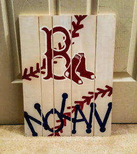
When a friend from high school requested a baseball-themed piece for her friend’s ‘arriving soon’ baby boy I couldn’t resist and I had an absolute blast letting my creative juice flow!
This was a brand new type of piece for me and I was thrilled with how it turned out – aside from it begin a Boston piece GO PHILLIES (sorry for the crummy photo though). My friend loved it and with that spurred another request from Anthony’s sister.
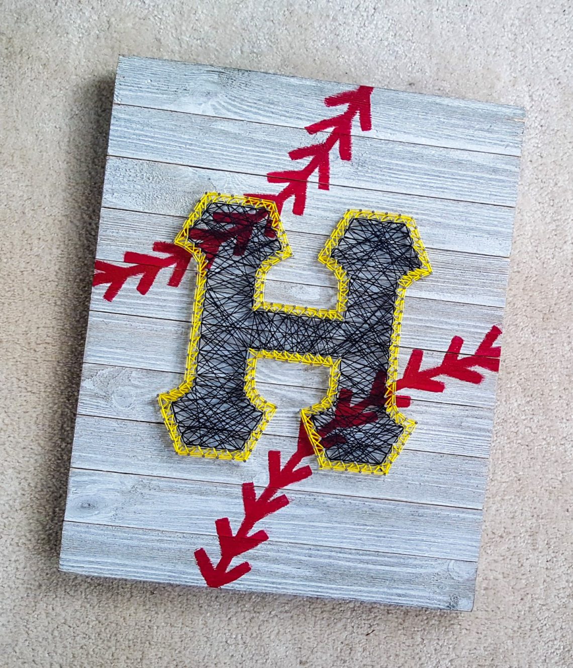
This new request was for a newly engaged couple that even used a custom Pittsburgh Pirates jersey during their proposal! How sweet is that?!
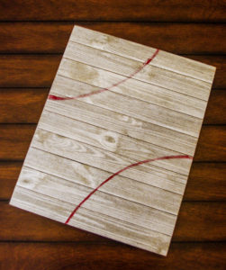
First things first we knew we wanted the same whitewashed wood look with the red laces in the background – I found this awesome piece of wood (already white in color BONUS!) at my local Walmart. It is 16″ wide by 20″ tall and has two slats on the back for easy hanging!
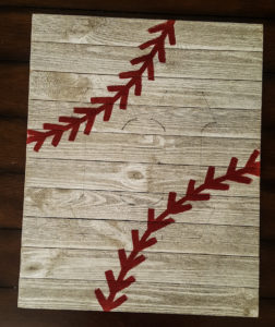
After sketching out the lines the laces would follow I painted in the design free-hand with acrylic paint. It’s not perfect (none of my pieces ever are) but at this point, I was happy with the improvements in details from piece to piece already!
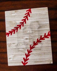
Once the laces were defined I took inspiration from the Pirates iconic ‘P’ and adapted some of the details into sketching out the couple’s soon-to-be new last initial!
Here comes the fun part (and the part that brings me back to one of the first pieces I ever made for a client!) – string art!
After I was happy with the sketch of the ‘H’ I went through and began hammering in all of the nails that would be needed to create a bold string art frame. I decided on using both the Pittsburgh gold and black – again taking inspiration from the Pirates’ font – so I needed to do a double layer of nails to give the look of an outline for the gold.
After a few headaches, and sore fingers – it had been a while since I have done any string art – I was finally ready for the final touches, the string!
I laced the black through first, I always start at one corner and work my way through the piece with the hope of not having to overlap back to the start if possible. I used a random pattern but tried to make sure I was consistent with the distance between nails so nothing looked too out of place. I layered enough for the piece to read clearly and boldly but I didn’t want it to be solid black. After I was done I decided to outline the outer nails used for the black to maintain a more cohesive look.
Next came the gold/yellow trim. This took a little more thought/I actually attempted to follow a pattern here since the space was so limited and needed to be equally dense. After two laps around the letter to achieve the desired boldness I again took to outlining the outer edge for a more polished look this time. I wanted to make sure the ‘H’ was defined nicely and wasn’t just ‘floating’ on the piece.
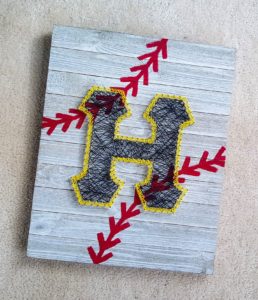
Honestly, I could not be more thrilled with how it turned out. It was such a joy to hand this off and I can’t wait to hear how the newly engaged couple likes it!
Here’s hoping I get the opportunity to create more pieces like this – it was just such a blast to combine so many fun elements! *fingers crossed*
Xo – Glance